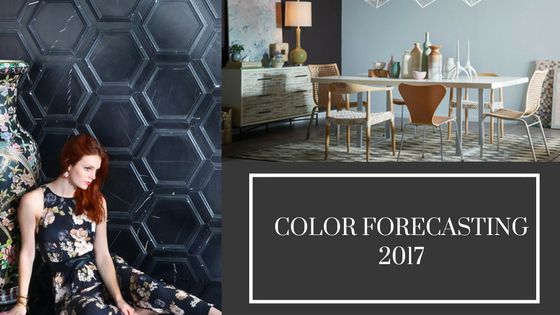
 What’s in store for design this coming year? 2017 is poised to see an influx of culture, spirituality, self-expression and soulful nostalgia.
The year 2017 will see homes and personal spaces emerging as the portraits of a shared future. Here's a deeper look at the forecast trends for color and specific hues for the coming year.
A Look Inside Color Forecasting
How are trending colors decided by designers? Who gets to make decisions on what should be considered fashionable year after year? If you’ve ever wondered how color forecasting is done, there is a sensible explanation.
Designers know that color is a significant tool, but it’s only a single element of the design as a whole. They must adapt to the client’s taste, while still suggesting what has been on trend according to forecasts.
Understanding how color trends work gives designers insight into new trends, but they must also know how to combine what is trendy with what suits the client's personality and preferences. This is where it takes designers with real experience to bring it all together.
Nowadays, color forecasting isn’t limited to “what’s hot” on the fashion markets of Milan and Paris. Designers who want to stay on top of trends must be efficient in studying trends from many resources. These include everything from the state of the economy to travel shows, websites, trade shows and other organizations set up specifically for trend-watching.
"We study information from many resources,” Jackie Jordan, director of color marketing for Sherwin-Williams, explains. “Forecast colors show the design community where colors are trending.”
Designing for the Future
The year 2017 sees more focus on bright and juicy colors that reflect an overall optimistic attitude. There will be more warm tones and lively colors, but no greys in the color forecast. This is a good thing! Two of the biggest color trends for 2017 are Noir and Holistic themes. Read on for an understanding of what these schemes and colors mean and how they can be conveyed in design.
The Noir Theme and Palette
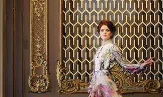 Noir speaks of the night: mysterious and deep. The theme is characterized by damask fabrics, jewel tones, dark veined marble and marbleized wall coverings.
Mindfulness
In a world charged with constantly glowing screens, many people feel the need to turn away from outward bright lights and instead focus inward to recharging the spirit. More designers are becoming mindful about everything that affects daily living, from eating habits and hobbies to the way they create and design their personal spaces.
Less screen time means turning off devices and allowing for a little solitude. It means turning away from the stress of the day and instead reflecting inward through mindful meditation.
Palette
The Noir palette echoes the shades used in the paintings of the great Dutch masters. They knew and loved its sensual luster. With rich, ripe fruits on the tables of still lifes and deep browns and blacks in portraiture, they often painted with moody neutrals, Nordic blues and golden yellows. These hues create a bittersweet yet sensual, mysterious mood. Noir characteristics are seen in damask fabrics, jewel tones, dark veined marble and marbleized wall coverings.
Baroque Romanticism
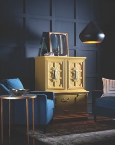 Dark fabrics and paint accented with lustrous gold trim and baroque prints are examples of Baroque Romanticism making a comeback in 2017. This is a color palette with dark blacks and navy shadows accented by pops of jewel tones. Against this dramatic backdrop you may set lustrous golds to shine even more brilliantly.
Celebrate the Night
Noir is a theme that celebrates the night and is reminiscent of stargazing or journeying to the ends of the earth to enjoy the northern lights. A resurgence in stargazing parallels the Noir theme. Families traveling into rural areas for stargazing overnights or adventurers escaping to Iceland for the Northern Lights characterize this emerging trend.
The Holistic Theme and Palette
The holistic theme continues to trend into 2017. It signifies a reawakening of spirituality, not only in the unseen chambers of your soul, but also in how you might express everyday living and designing your world. It is a world you can choose by sustainable design, radical transparency, repurposed goods and sustainable products.
The New Luxury of Design
In a world where “doing good is the new looking good,” there are new trends highlighting holistic living: This is the new luxury. This is the lifestyle celebrities are making trendy, and more people are expected to follow suit.
Rather than frivolous or extra luxurious holidays, more people are spending their free time volunteering in far-flung places or developing countries. Experiential travel has changed the way people vacation. The new luxury means a literal escape from it all, and choosing quiet zones instead of packed tourist destinations. Some choose to purposely go far away to places where the internet and smartphones don’t exist — and don’t need to.
Wild Lux
 Experiential travel also means emphasizing the connection between human beings and the landscape. Gone are the days of conspicuous consumption as buyers become more socially conscious.
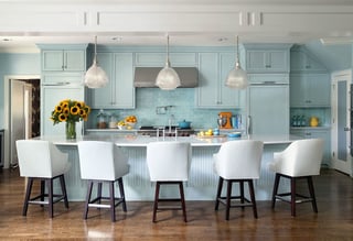
Thematic colors for this palette are blush colors, sage greens and Williamsburg blue. In the design world, holistic living is expressed with raffia and wicker, botanical patterns and diluted watercolor prints. This is a world where less is more, and more means more “natural.”
Love the new colors, trends and themes for the coming year? Come explore our stock collection for more inspiration.

