Image via AKDO
From bathrooms to kitchen backsplashes and even commercial settings, subway is the ultimate in ubiquitous tile. Named for the New York City train stations in which they were originally found in the early 1900s, these tiles quickly captured the public's imagination with their revolutionary layout. Since then, they have remained a top choice among a variety of homeowners and designers.
There's a difference between commonplace and trendy. Today's subway tiles can be seen in every setting and context, but that doesn't mean they attract attention. However, they're far from "out" - if the latest CERSAIE trade fair is any indication. Designers are still willing to incorporate subway style into new looks, but it's not exactly the subway tile we've come to expect.
Is Subway Tile Still in Style?
Sleek, simple and easy to clean, there's a lot to love about subway tile. Designed by George C. Heins and Christopher Grant La Farge, this universally adored style took over homes during the first half of the 20th century -- and never left.
The most familiar subway pattern features rectangular tiles (typically 3x6 inches) arranged horizontally. Instead of stacking, rows of tiles are usually offset; the end of one tile stacks directly above the center of another. This is called a 50% offset.
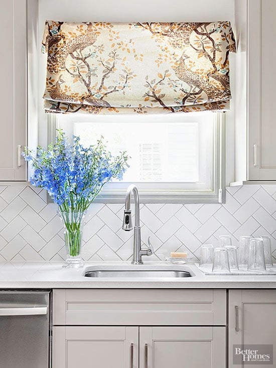
Subway's simple sophistication grants it unique longevity. Those with limited decorating budgets can take solace in the knowledge that their investment will stand the test of time, stylistically speaking. Jenn Sullivan, one of our Design Consultants believes subway tile “is a classic, like that crisp white oxford in your close. It plays nice with everyone and can be featured in other colors.”
If there's one downside to the timeless nature of subway tile, it's familiarity. We've seen this style so much over the years that it's edging on cliche. It's possible to make a statement with subway tile, but only with a brash color or other creative elements. Installing neutral subway tile is the epitome of playing it safe.
On-Trend Tile Insights from Our Design Consultants
Timeless and trendy. It's a tough middle ground to achieve with subway tile, but it's far from impossible. Our experts believe in the power of a style refresh to revive even the most uninspiring mainstays of HGTV. Keep reading for detailed insights from the region's most impressive designers.
The Power of Color
Imagine a stereotypical subway tile backsplash. Which color do you picture? In all likelihood, you think of white or off-white ceramic tiles. It's easy to see why glazed white subway tiles are so popular, but the look feels a bit overplayed.
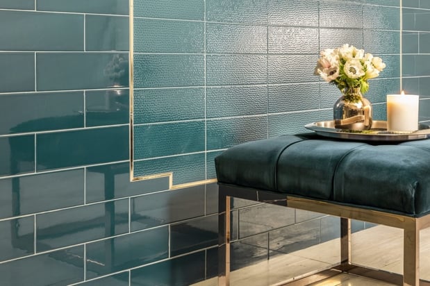
Mattew Quinn for AKDO
One of the easiest ways to switch it up? Different colors. Design Consultant Jenn Lindahl advocates for "bright color and warmer palettes." Kara Levine agrees, adding that contrasting colors can create a more dramatic look. Metallic can add a glamorous sheen for bar backsplash; Jenn Sullivan is partial to the "metallic-y glazes from Encore and Lunada Bay."
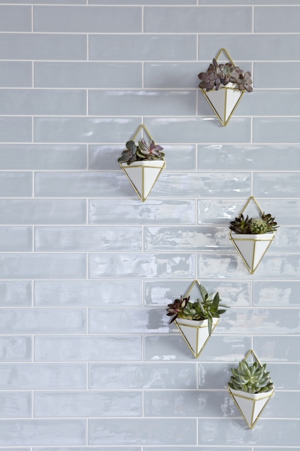
Image via AKDO
Bright colors and metallics are great options, but not absolutely necessary. Overall, Lindahl is noticing the market overall replacing traditional neutrals such as grey and white with "truer tones of charcoal and oatmeal."
Amping Up Texture
If bright colors feel a bit too risky, consider unique textures as a low-key alternative. Texture adds visual interest while allowing you to retain a neutral palette. It's also a hot trend in 2018, and therefore perfect for modernizing classic subway patterns.
Kara Levine loves how textured style is available for a range of budgets. Her clients adore textured stone, but are just as happy to invest in textured ceramics and porcelains when stone is not financially feasible. A variety of options are available for texture enthusiasts; Monica Lozano recommends offerings from Pratt & Larson and Akdo.
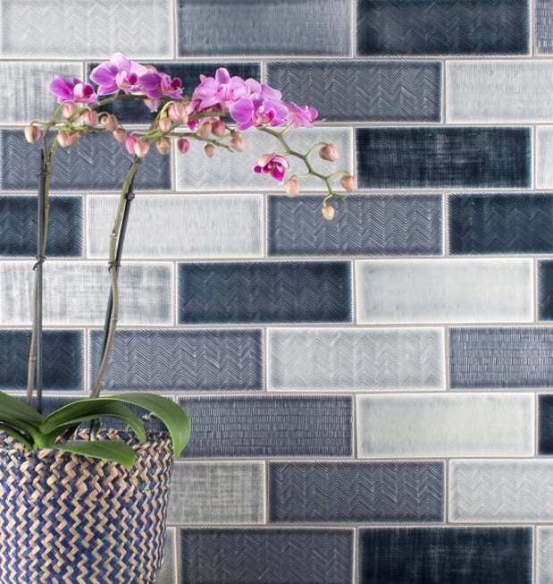
Image via Pratt & Larson
In Case You’re “Over” Subway Tile
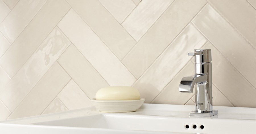
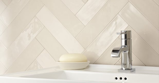
Perhaps you’re ready to break away from the rectangular shape that defines subway tile. Square tiles provide a burst of fresh air without diverging too much from the traditional subway look. Adventurous types may prefer the large-format hexagon tiles favored by Sarah Lewis. Herringbone tile, seen in recent years at CERSAIE, holds much of subway's classic appeal while still packing a visual punch.
Playing with Tile Size
Large format remains a popular option for tile flooring, and now, expanded size is taking over subway backsplash. Although 3x6 inch tiles dominate, many homeowners opt for larger tiles such as 3x12 or even 4x16. Kim Storm believes that different sizes make subway tile look more interesting without feeling risky.
Vertical Orientation
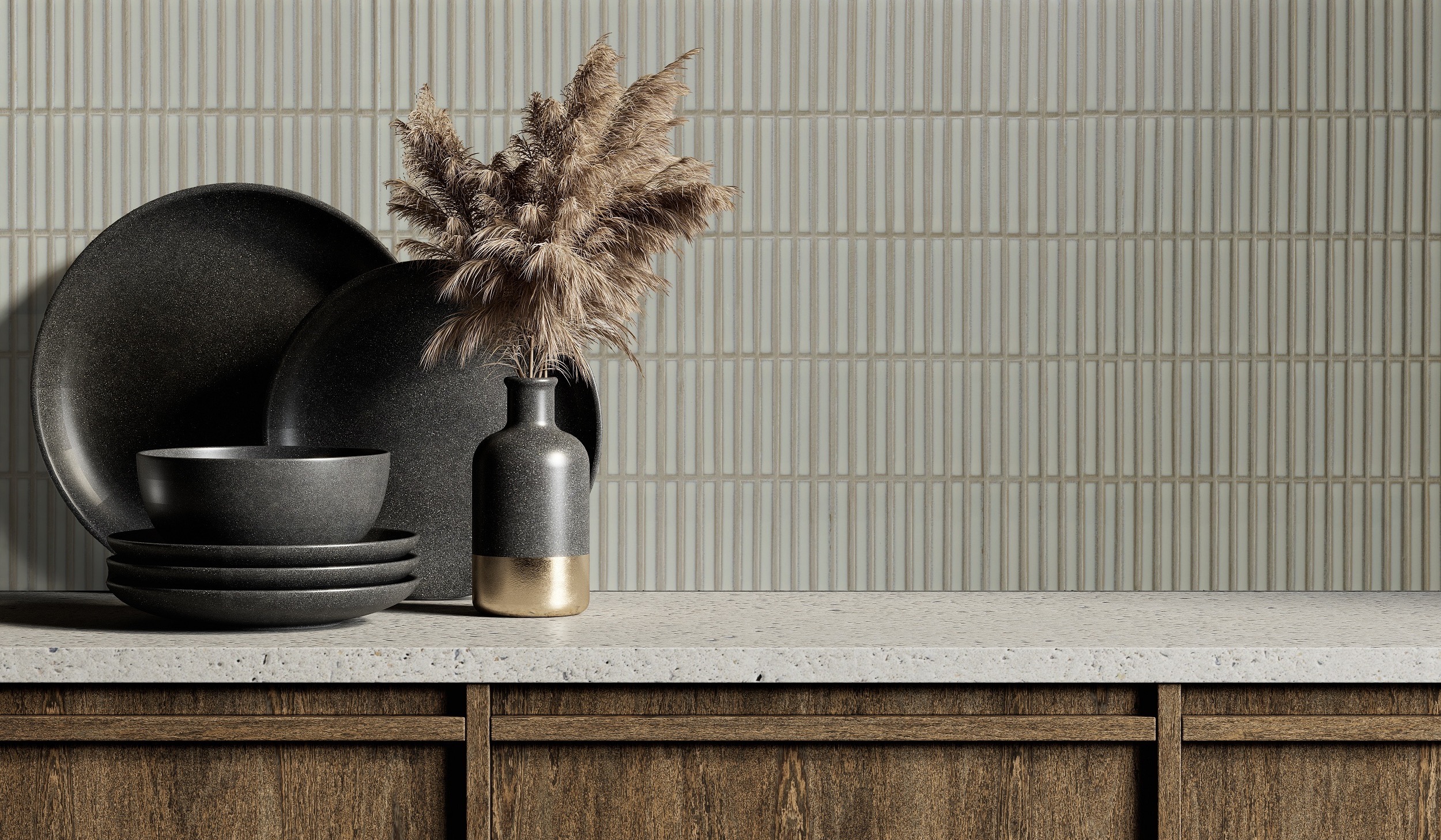
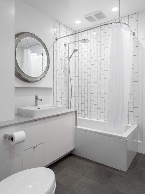
Lead Design Consultant Michelle Baum's simple trick for spicing up traditional subway tiles? Defying expectations with a vertical layout. After all, subway style nearly always features horizontal orientation. Monica Lozano highlights stacked vertical as another possibility. Vertical designs suit rooms with low ceilings, as the tiles visually extend the perceived ceiling height.
Choose the Right Location
Subway doesn't need to dominate the entire home. Consider opting for daring designs in primary bathrooms or kitchens, while sticking with tried-and-tested subway tile for other rooms. For example, Sarah Lewis regularly sees subway designs in kid's bathrooms and other secondary rooms.
A few small tweaks can transform subway tile from boring to daring. From new colors, patterns and scales to trendy textures, it's time to leave your comfort zone and get creative. Brainstorm a few ideas that might work in your home before visiting your local Denver, Vail or Aspen tile showroom.
Looking to update the tile in your home? Contact us today to schedule a design consultation.

