Each new year delivers a whirlwind of exciting design opportunities. We always look forward to experimenting with fresh colors – so we eagerly anticipate Pantone's Color of the Year announcement. We’re consistently pleased by the gorgeous colors that Pantone’s experts highlight.
As a respected authority, the Pantone Color Institute draws upon the year's most relevant themes to select a hue that reflects these trends. Beyond this, the Color of the Year sets the stage for the aesthetics that will dominate in months to come.
We've observed a noteworthy shift towards bold hues these past few years, so it should come as no surprise that this trend remains front and center in 2022. Early hints of this were evident in 2021, when, although Ultimate Grey reigned supreme, the bright and sunny appearance of Illuminating gave us plenty of upbeat vibes.
Building on this trend, Pantone has highlighted Very Peri as the 2022 Color of the Year. Reflecting the power of personal invention, this vibrant color promotes unquestionable creativity.
Very Peri + Pantone's 2022 Palettes
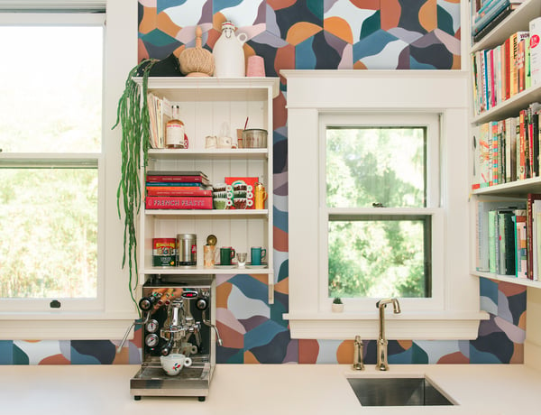
In the neutral-dominant world of yesteryear, bright hues such as Very Peri were primarily used as accents. This remains an excellent option in 2022, of course, but bold color combinations are even better. If you're accustomed to subtle solutions, however, daring color combinations can feel overwhelming at the outset.
Not sure where to start? Pantone offers excellent suggestions with its strategically selected palettes. Each evokes a distinct mood, with the aim of conveying the color's unique versatility. Top options include:
AMUSEMENTS
Pantone refers to this collection as a "joyous and whimsical color story." Fuchsia Pink is bound to attract attention, with Paradise Pink and Tawny Orange also exemplifying this palette's playfulness.

WELLSPRING
While we tend to picture earthy tones as muted, they can be surprisingly vibrant, as seen in the Wellspring palette. Discover a new take on holistic style with colors such as Greenbriar, Treetop, and Dewberry.

BALANCING ACT
If you like the idea of playing with color but need to ease in after years of using neutrals, Balancing Act is for you. Blending warm and cool tones, this lively collection is perfect for artistic spaces.

THE STAR OF THE SHOW
Determined to keep the focus on Very Peri? This aptly named collection is your best bet. It's primarily made up of neutrals, which draw attention to 2022's exuberant purple hue.

Very Peri Decorative Tile Opportunities
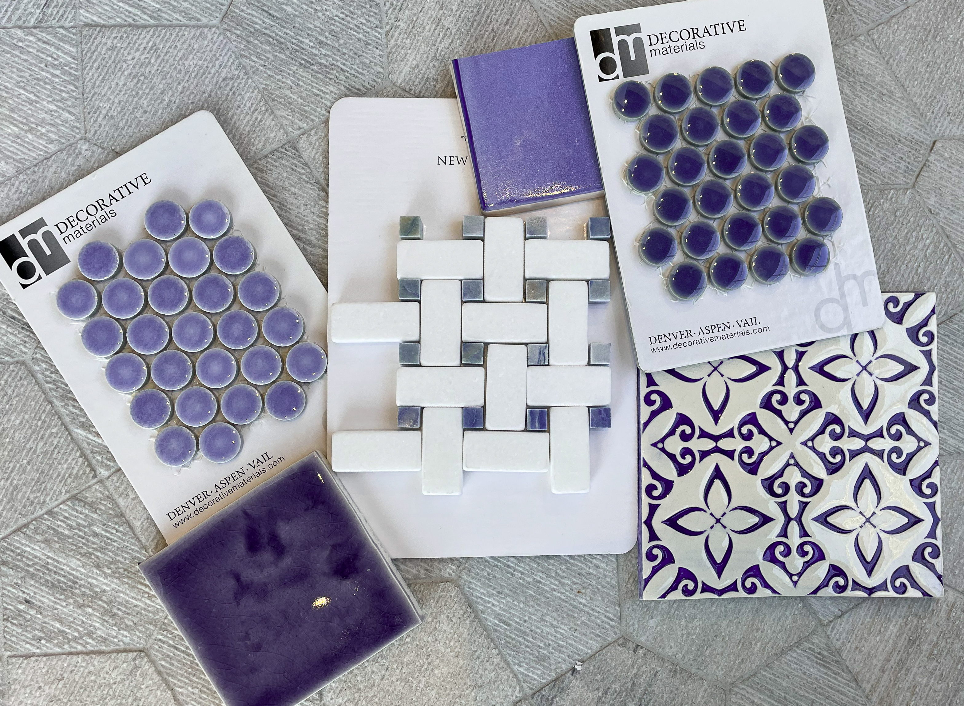
Integrating Very Peri is a blast, as this playful color works wonderfully with some of today's most impressive decorative tiles. Options abound, but we're especially excited about the potential for building Very Peri into these ceramic and cement tile designs:
KUJU COLLECTION: LA FRUITA
Perfect for the aforementioned Amusements palette, these favorites from the Kuju Collection can easily make a statement. The concrete tiles can be tossed together to create a perfectly imperfect design that feels both random and purposeful. They are available in two main color collections: Light 1 or Dark 2. The dark option feels more grounded than its light counterpart and pairing the two together can bring out the best of Very Peri.
 La Fruita Light 1 + La Fruita Dark 2
ARTISTIC TILE: ECHO VIOLIN VIOLET
Eager to give Pantone's Wellspring palette a try? Harness the gradient power of Echo tiles, which can be used to craft an alluring mosaic. Artistic Tile's Violin Violet grants purple a serene feel, with the effect boosted by a lovely color spectrum that moves from the center of each tile to the edge.
ELISA PASSINO: OLTREMARE GLAZE
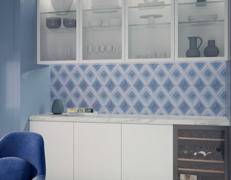
We adore Elisa Passino's ceramic tile designs. Her Oltremare glaze, in particular, complements the whimsical essence of Very Peri. We're especially fond of her geometric Obelisco pattern when used with the Oltremare glaze, which creates a simultaneously vibrant and soothing aesthetic. This glaze is available to use with any of the Elisa Passino tiles from her Geometrie Componibili collection.
Explore New Colors with Decorative Materials
Our team at Decorative Materials is always excited to work with the latest and greatest Pantone palettes — and this year is no exception.
We'd love to get in touch to discuss your next project. You'll find a wealth of inspiration in our tile showrooms, so don't hesitate to schedule an appointment.

.png?width=600&name=DECMAT_Obelisco_1%20(1).png)

