.jpg)
Each year, Sherwin-Williams’ Colormix Forecast invites designers to look beyond color—to explore emotion, materiality, and cultural influence through curated palettes. The 2026 Colormix Forecast focuses on creating sanctuary, embracing craftsmanship, and finding calm in complexity.
While paint sets the tone, tile and stone complete the story. At Decorative Materials, we see these color directions reflected in the surfaces designers are gravitating toward—natural textures, tactile finishes, and grounded, biophilic warmth. Here’s how each palette translates beautifully through tile, stone, and surface design.
Frosted Tints: Weightless Minimalism Meets Subtle Texture
This airy palette of icy blues, greens, and lavenders represents a new kind of minimalism—one that feels soft and restorative rather than stark. The tones are cool yet comforting, evoking misty mornings and diffused light.
In tile form, this look comes alive through iridescent glass mosaics, pale marbles like Lilac or Calacatta Bluette, and softly glazed ceramics that introduce light movement and shimmer. Think of honed finishes, linear mosaics, or translucent glass that reflect the palette’s ethereal energy. The result is a feeling of calm clarity—serene, refreshing, and quietly modern.
Sunbaked Hues: Organic Warmth and Earth-Born Texture
2026 sees a continued return to warmth through muted terracottas, clay reds, amber yellows, and mineral neutrals—a palette rooted in biophilic design and human connection. Inspired by desert landscapes and organic architecture, these colors echo the work of Frank Lloyd Wright and Georgia O’Keeffe, blending art, nature, and sustainability.
Tile and stone express this palette through handcrafted zellige, textured terracotta, and matte-finished porcelain in sun-washed tones. Ribbed surfaces and natural variation bring the tactile quality that defines this theme. These materials pair beautifully with wood, plaster, and metal—perfect for projects prioritizing warmth, wellness, and connection to the earth.
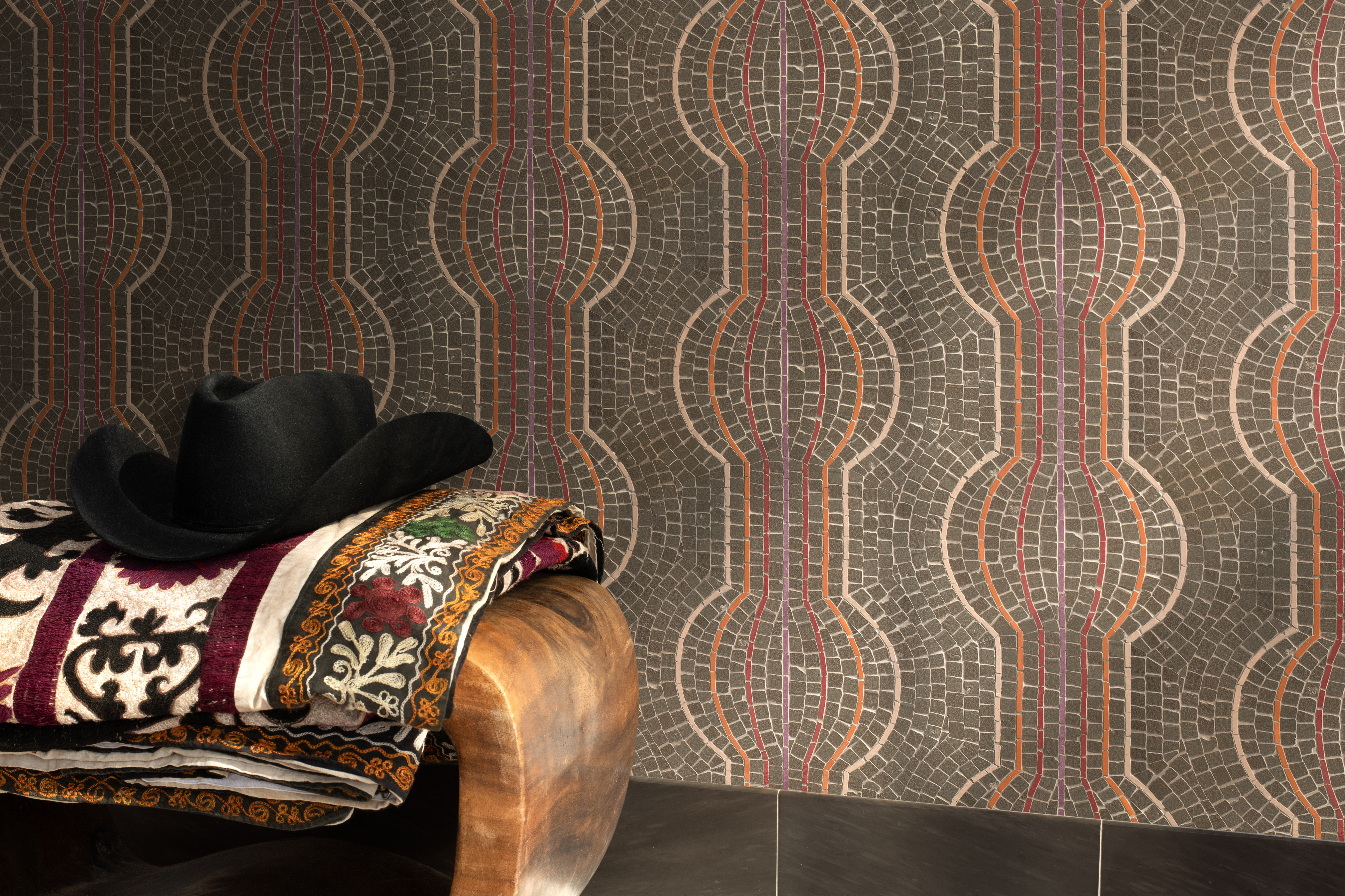
Restorative Darks: Quiet Drama and Grounded Luxury
Deep, moody hues such as Prussian blue, antique gold, and dark olive green lend sophistication and depth to 2026 interiors. These tones are introspective, inspired by history, and layered with cultural resonance—balancing serenity with richness.
Tile and stone echo this grounded luxury through oxidized metallics, patinated brass, and dark marbles like Nero Marquina or Pietra d'Avola. Smoky glass mosaics and brushed limestone introduce texture while keeping the palette subdued. This is the realm of moody powder rooms, dramatic libraries, and intimate hospitality settings—spaces that feel both cocooning and elevated.
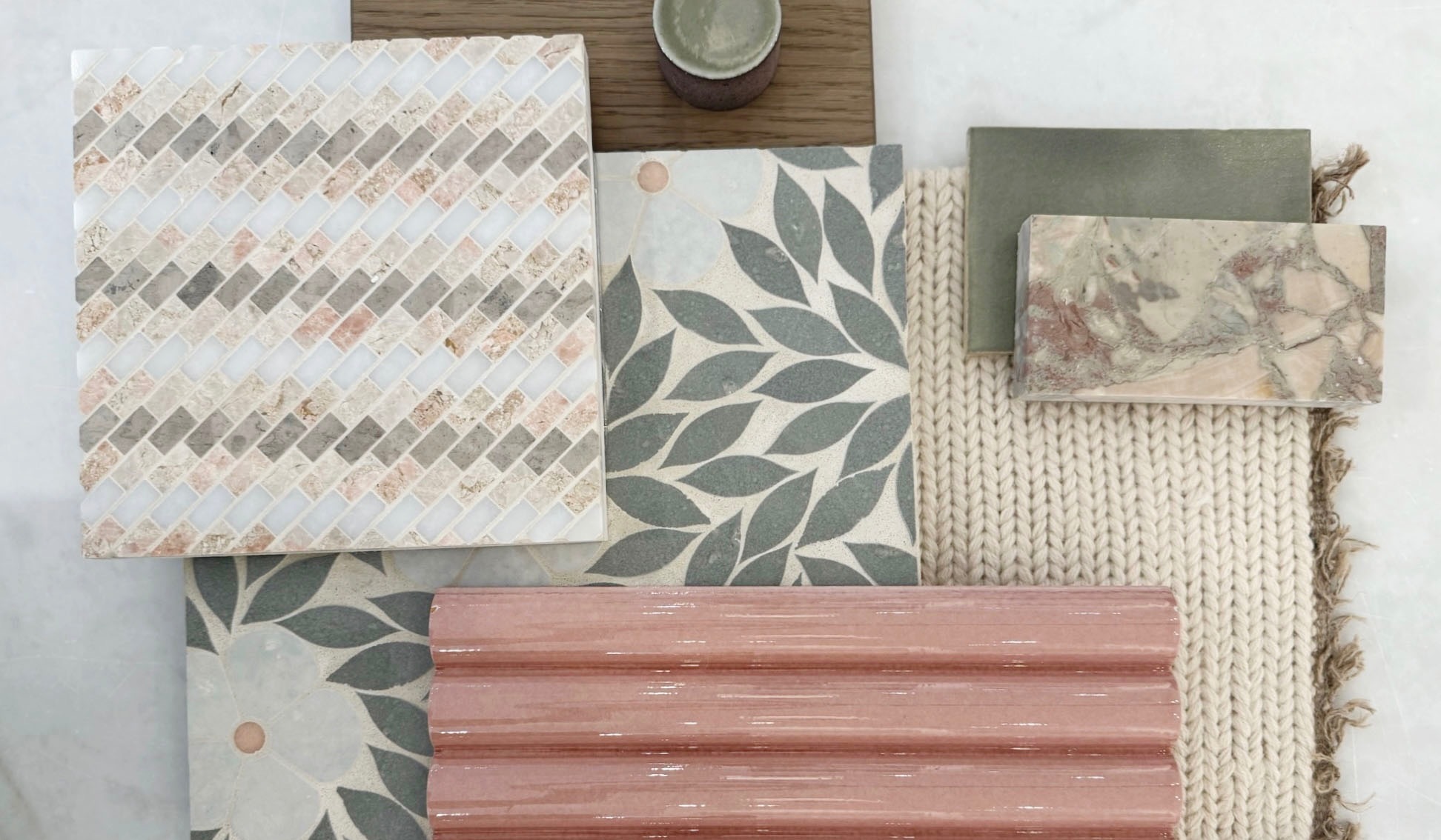
Foundational Neutrals: Nature-Inspired Balance
Sherwin-Williams’ foundational neutrals expand on the idea of black and white, evolving into warmer taupes, khakis, and soft stone-inspired shades. These tones serve as the backdrop for wellness-centered, sensory interiors—versatile enough to complement any of the Colormix palettes.
Natural stone is the perfect partner here: limestone, travertine, and honed marble add organic movement and timeless appeal. Crackle-glazed ceramics and sculptural porcelain forms introduce a handcrafted touch. Together, they create a grounded foundation that promotes calm, connection, and quiet sophistication—values at the heart of the 2026 design ethos.
Color of the Year: Universal Khaki
Described as a “color of connection,” Universal Khaki is the neutral bridge between warm and cool tones—a natural fit for materials that celebrate authenticity and balance.
In tile and stone, this translates to soft-beige limestones, cream-toned porcelains, and warm white ceramics that feel approachable and elevated. The shade’s versatility allows it to pair effortlessly with both the Frosted Tints and Sunbaked Hues palettes, creating harmony across mixed materials and finishes.
Designers can embrace Universal Khaki through layered surfaces—textured stone flooring paired with subtly glazed wall tile, for example—to create interiors that feel grounded, natural, and enduring.
Choosing the Right Tile at Decorative Materials
The Sherwin-Williams Colormix Forecast 2026 celebrates connection—between materials, makers, and the natural world. Tile and stone have always embodied these same principles: timeless craftsmanship, sustainable beauty, and the power to transform space through texture and tone.
At Decorative Materials, our showrooms across Colorado bring these color stories to life through a curated selection of tile, stone, and surface materials that reflect today’s leading design directions. Whether you’re drawn to the serenity of Frosted Tints, the organic warmth of Sunbaked Hues, or the moody sophistication of Restorative Darks, our team can help you pair color with material to craft spaces that feel both timeless and distinctly 2026.
Visit one of our Colorado showrooms and connect with our Design Consultants to explore color-forward tile and stone combinations inspired by the Sherwin-Williams Colormix Forecast 2026.